
Ich bin seit ca. 1992 Apple Kunde. Das Powerbook Duo 250 war mein erstes Gerät. Im Vergleich zu heutigen Geräten stellt das Gerät sämtliche aktuellen Apple Produkte hinsichtlich Reparierbarkeit und Geschwindigkeit in den Schatten. Ja, auch bei der Geschwindigkeit! (Update: Und da bin ich nicht allein.) Denn die „Apps“ damals hießen die noch „Programme“ laufen auf einem Mac OS 7.1 verdammt schnell und sind viel einfacher zu bedienen. Sogar die Suche nach einer Datei ist unter Mac OS 7.1 einfacher per Apfel-F-Taste zu realisieren als mit Spotlight unter OS X 10.9.4 wo ich im Finderfenster „name:Suchwort“ eingeben muss, um zu finden was ich suche. Aber das soll nicht mein Thema hier sein.
Von „Less is More“ zu „Bigger is bigger“
 Apple hat mit der letzten Vorstellung seiner neuen Produkte einen Weg eingeschlagen, der eine Ära beendet. Kurz vorweg ich respektiere die grandiose Leistung und „Execution“ von Tim Cook und seinem Team. Es erscheint mir sogar so, dass die Firma nach Steve agiert wie als sei eine Handbremse gelöst worden. Es geht ein wenig Richtung übereifrig, streberisch und überambitioniert. Vermutlich ist das besser, als sehr bedächtig vorzugehen, daher mein voller und ernsthafter Respekt für die gezeigte Leistung. Die Firma sieht sich jetzt jedoch auf dem Pfad eines „More is More“-Apologeten. Sie unterscheidet sich damit für mich nur noch schwer von anderen IT-Firmen.
Das schreibt auch Felix Salmon:
Apple is buying into the More Is More mindset
Quelle: Apple hasn’t solved the smart watch dilemma
Rückblick: How Apple rolls
Update 10.Juni 2014 Dieser Abschnitt wurde nachträglich eingefügt.
This is how the designers and engineers at Apple roll: They roll.
They take something small, simple, and painstakingly well considered. They ruthlessly cut features to derive the absolute minimum core product they can start with. They polish those features to a shiny intensity. At an anticipated media event, Apple reveals this core product as its Next Big Thing, and explains—no, wait, it simply shows—how painstakingly thoughtful and well designed this core product is. The company releases the product for sale.Then everyone goes back to Cupertino and rolls. As in, they start with a few tightly packed snowballs and then roll them in more snow to pick up mass until they’ve got a snowman. That’s how Apple builds its platforms. It’s a slow and steady process of continuous iterative improvement—so slow, in fact, that the process is easy to overlook if you’re observing it in real time. Only in hindsight is it obvious just how remarkable Apple’s platform development process is.
One example is Apple’s oldest core product: Mac OS X. It took four difficult years from Apple’s acquisition of NeXT in 1997 until Mac OS X 10.0 was released in March 2001. Needless to say, those four years were… well, let’s just say it was a difficult birth. But from that point forward, Mac OS X’s major releases have appeared regularly (especially by the standards of major commercial PC operating systems), each better than the previous version, but none spectacularly so. Snow Leopard is vastly superior to 10.0 in every conceivable way. It’s faster, better-designed, does more, and looks better. (And it runs exclusively on an entirely different CPU architecture than did 10.0.) But at no point between the two was there a release that was markedly superior to the one that preceded it.
Next, consider the iPod. It debuted in the fall of 2001 as a Mac-only, FireWire-only $399 digital audio player with a tiny black-and-white display and 5 GB hard disk. The iTunes Store didn’t exist until April 2003. The Windows version of iTunes didn’t appear until October 2003—two years after the iPod debuted! Two years before it truly supported Windows! Think about that. If Apple released an iPod today that sold only as many units as the iPod sold in 2002, that product would be considered an enormous flop.
Today you can get an iPod nano for $179 that’s a fraction of the original iPod’s size and weight, with double the storage, a color display, video playback, and a built-in video camera. Apple took the iPod from there to here one step at a time. Every year Apple has announced updated iPods in the fall, and every year the media has weighed in with a collective yawn.
There’s never been one iteration of the click-wheel iPod platform that has completely blown away the previous one, and even the original model was derided by many critics as unimpressive. The iPod shows, too, how Apple’s iterative development process doesn’t just add, it adapts. Remember those third-generation iPods from 2003, with four separate buttons above the click wheel? Turns out that wasn’t a good idea. They were gone a year later. Remember the iPod Mini? It had no new features, and wasn’t even much cheaper— but it was way smaller.
The iPhone is following the same pattern. In 2007 it debuted with no third-party apps, no 3G networking, and a maximum storage capacity of 8GB. One year later, Apple had doubled storage, added 3G and GPS, and opened the App Store. The year after that, Apple swapped in a faster processor, added a compass and an improved camera, and doubled storage again. The pattern repeats. We may never see an iPhone that utterly blows away the prior year’s, but we’ll soon have one that utterly blows away the original iPhone.
That brings us to the iPad. Initial reaction to it has been polarized, as is so often the case with Apple products. Some say it’s a big iPod touch. Others say it’s the beginning of a revolution in personal computing. As a pundit, I’m supposed to explain how the truth lies somewhere between these two extremes. But I can’t. The iPad really is The Big One: Apple’s reconception of personal computing.
Apple has released many new products over the last decade. Only a handful have been the start of a new platform. The rest were iterations. The designers and engineers at Apple aren’t magicians; they’re artisans. They achieve spectacular results one year at a time. Rather than expanding the scope of a new product, hoping to impress, they pare it back, leaving a solid foundation upon which to build. In 2001, you couldn’t look at Mac OS X or the original iPod and foresee what they’d become in 2010. But you can look at Snow Leopard and the iPod nanos of today and see what they once were. Apple got the fundamentals right.
So of course this iPad—the one which, a few years from now, we’ll refer to off-handedly as the “original iPad”—does less than we’d hoped. That’s how the people at Apple work. While we’re out here poking and prodding at the iPad, they’re back at work in Cupertino. They’ve got a little gem of a starting point in hand. And they’re beginning to roll.
Quelle: This is how Apple rolls by John Gruber in May 13, 2010 10:35 AM for Macworld.
Welche Uhr eigentlich?
Die vorgestellte „Uhr“ ist nichts als ein Mini-iPod der nur mit einem iPhone gekoppelt überhaupt nutzbar ist. Der Mann der dieses Produkt vorführte sagte das als ersten Satz: „iPhone required.“
Was soll das für eine Uhr sein, die ein iPhone benötigt um zu funktionieren? Das iPhone ist also der Hardware-Dongle, damit das andere Produkt überhaupt einsetzbar ist. Jemand anderem kann ich die Uhr vermutlich auch nicht mal eben ausleihen.
Apple hat einfach den ganzen iOS Stack in ein Gehäuse gestopft. Macht das Sinn? Für eine Uhr? Nein! Ich will keine Uhr, die den geplanten Obsoleszenz-Zeiträumen unterliegt für Smartphones. Diese Uhr könnt ihr behalten Apple. Viel schlimmer aber als der Versuch ein neues Produkt mit Dongle zu vertreiben finde ich die Abkehr von der Einstellung „Less is More“. Hier findet eine Zeitenwende in Apple’s Philosophie statt.
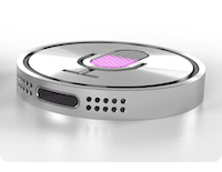
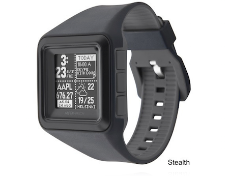
Wie hätte die Uhr aussehen müssen?
Wer eine Smarte Uhr entworfen hätte, der hätte diese unter den Rahmenbedingungen die derzeit herrschen designed und nicht diese schamlos ignoriert.
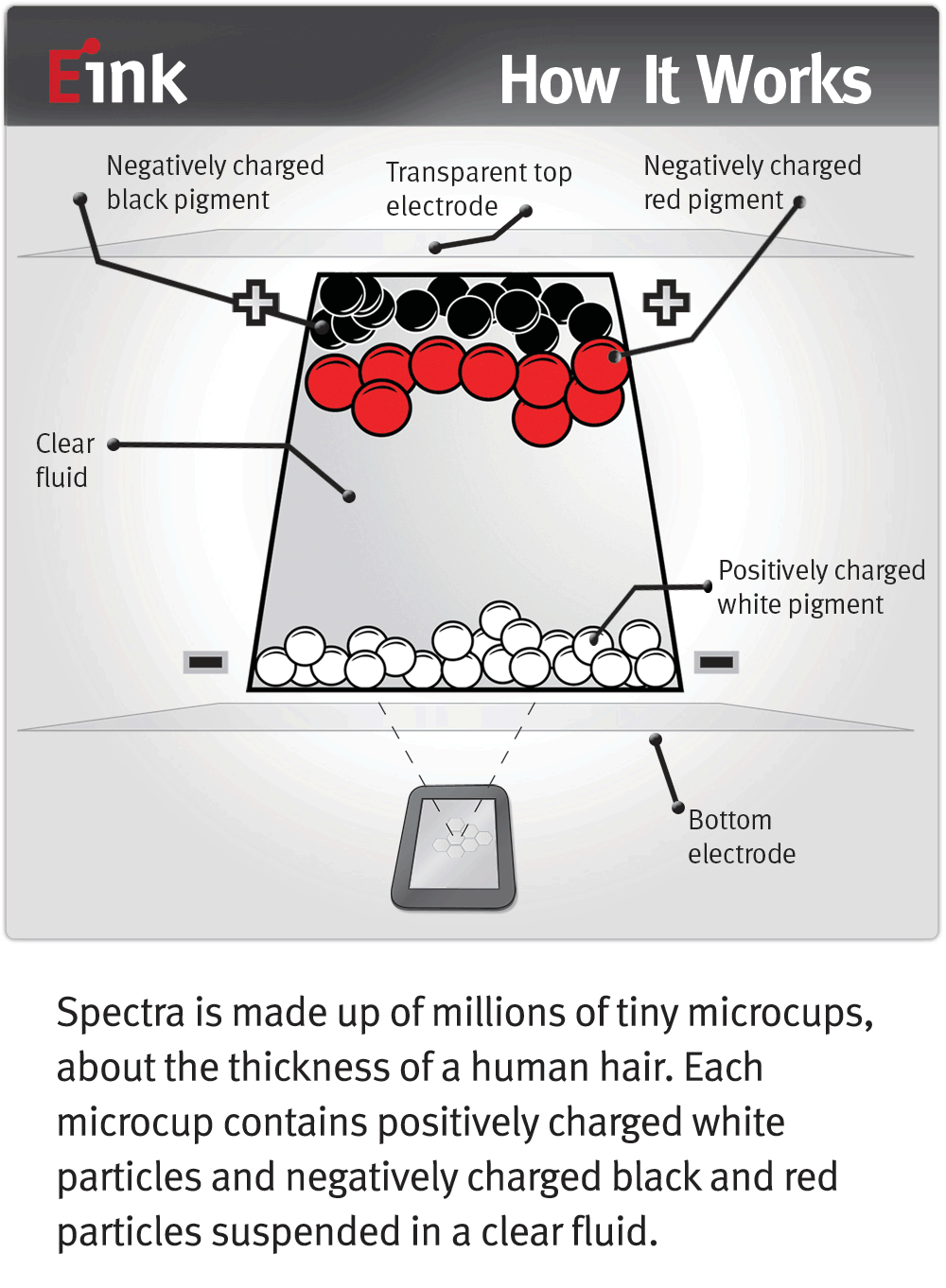
Die Uhr hätte 100% auf ein e-Ink-Display setzen müssen um überhaupt in die Reichweite einer vernüftigen Batterielaufzeit zu gelangen. Sie hätte auch autonom OHNE iPhone einen sinnvollen Wert haben müssen, z.B. eben für den Einsatzzweck Sport (Zeitmessung, Streckenmessung, Pulsmessung, Höhenmessung). Ich hätte mir einmal die kleinsten GPS-Geräte angeschaut, und das Fazit gezogen, dass es eventuell Sinn macht, die Uhr per Bluetooth an ein Bluetooth GPS (ebenfalls von Apple) nur für das Laufen/Sport zu koppeln, denn der Strom- und Platzbedarf dieser Funktion ist einfach noch zu groß für eine Uhr.
Funktionen:
- e-Ink-Display (3 farbig: weiß, schwarz, rot oder amber)
- Zeitmesser (Uhr und Rundenzeiten)
- Streckenmesser (über Accelerometer, Kompass & Gyro)
- Als Fernbedienung nutzbar für (Apple TV, Keynote, iTunes)
- Wasserdicht (um auch für Schwimmer Bahnzeiten zu nehmen)
- Bluetooth LE only (offenes Daten-Protokoll für Apps)
- Laden per Induktion (Keine Öffnungen für Kabel)
- Basic & Pro Edition (Unterscheiden sich nur in Batterielaufzeit & Dicke/Größe)
- Reine Firmware, keine updatefähige Software
- Akku durch Service wechselbar
- Preis ca. 249 €
Das Teil hätte ich gekauft. Was hier vorgestellt wurde ist ein Mini-iPod mit iPhone als Hardware-Dongle mit einer anvisierten maximalen Nutzungsdauer von nicht mehr als 5 Jahren, dann ist es feinster, vergoldeter Elektroschrott.
Einfach einen iPod auf Uhrengröße zu schrumpfen und als Fashion-Artikel rauszuhauen, das das nicht gut gehen kann, das werden wir noch erleben, da bin ich mir ziemlich sicher.
Welches Problem löst diese Uhr?
Das ist die große Frage, der Elefant der im Raum steht. Ich hab eine Uhr eine schön große und schwere, elegante, mit viel Mechanik. Diese Apple Uhr hingegen löst einzig ein Problem: Dass man sein iPhone nicht unbedingt ständig in der Hand haben muss und aus der Tasche ziehen muss. Sie ist eine Relaisstation, der dumme Client oder Thin-Client für das iPhone.
Jetzt bleibt die Frage im Raum stehen, ist es das was wir alle brauchen? Ein dumb Client bzw. einen Bildschirm am Handgelenk, der eigentlich nur als Minibildschirm für das iPhone in der Tasche dient? Warum hat Apple dann nicht einfach ein reines Bildschirmrelais entwickelt? Einfach nur einen AirPlay-Screen? Dann hätte die Batterie vermutlich massig Laufzeit gehabt. Wäre der Screen noch ein e-Ink-Display gewesen umso mehr Laufzeit. Apps hätten spezielle AirPlay-Outlets definieren können die auf die Uhr passen und in Schwarz/Weiß/Rot-Farben funktionieren.
Update: Depublikationsschutz für „Steve Jobs Introduces the iPhone 6 and Apple“ (als PDF)
Yosemite
Jetzt bin ich auch gezwungen auf Yosemite zu wechseln. Zu erwartende Vorteile? Keine. Zu erwartende Kosten? 1-2 Tage alles neu aufsetzen & installieren, also ca. 1600 EUR. Aber Hauptsache das OS ist kostenlos. Die Kosten werden einfach auf den Consumer und Developer abgewälzt. Der keine andere Wahl mehr hat als zu upgraden, denn ob Dinge funktionieren hängt jetzt von der Synchronizität ab, das ALLE OS releases die man so in Betrieb hat also Apple Watch OS, iOS, OS X auf dem selben Level sind. Sind sie es nicht gibts Probleme. Das spricht bloss niemand mehr offen aus, ist aber so. Es wird nur eine Frage der Zeit sein, bis auch das Apple TV OS in diesen Dependency-Cycle-from-Hell mit eingereiht wird. Dannmuss der Fernseher, das Telefon, die Uhr und der Rechner mit dem gleichen OS Level laufen sonst geht nix. Klasse Fortschritt!
Hier ein paar Links die hilfreich sind dem Wahnsinn zumindest ein wenig die Stirn zu bieten:
If you’ve upgraded to Mac OS X Yosemite (10.10) and you’re using the default settings, each time you start typing in Spotlight (to open an application or search for a file on your computer), your local search terms and location are sent to Apple and third parties (including Microsoft).
Der Effekt den diese ganzen Systemübergreifenden Abhängigkeiten schaffen ist fatal. Es lässt sich schlicht nicht mehr vorhersagen, ob etwas funktionieren wird. Denn die Komplexität der möglichen Konfigurationen explodiert förmlich.
Die Folge ist eine extrem schnell sinkende Qualität der Nutzererfahrung (UXP). Und das bemerken Rockstar Developer als erste, aber auf die hört ja längst niemand mehr. Mein Lieblingszitat dazu ist das Folgende:
Apple: “We cannot keep up with developing stable software for OS X and iOS, so let’s have a new programming language and create a watch OS.”
Apple’s Software Quality Decline (Depublizierungsschutz PDF)
Apple’s Software Quality, Continued (Depublizierungsschutz PDF)
All this looks to me as if someone is strategically taking the VUCA-path (Volatility, uncertainty, complexity and ambiguity) to create shockwaves.
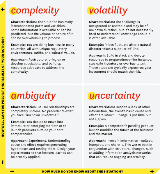
Source: Harvard Business School Publishing
What VUCA Really Means for You
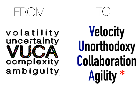
UPDATE 10.6.2015
Gerd Leonhard thinks the future will be more successful approchaed using a different kind of of VUCA (see his PDF of a presentation) like the following gfx suggests…
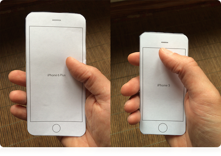
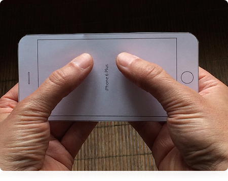
Why do I blog this? Ich bin etwas enttäuscht, vor allem aber auch besorgt ob der Abkehr von „Weniger ist Mehr“. Diese Uhr ist auch ein wenig Ausdruck von Größenwahn. Sie wird einige Abnehmer finden, das ist sicher. Vor allem die Leute die damit zum Ausdruck bringen dass sie Geld haben, werden diese Uhr als Spielzeug mögen. Eine Zeitenwende hin zu einem nützlichen Wearable ist das längst noch nicht. Und die unsinnige Vorstellung eines iPhone 6 plus zeigt, dass Apple nicht einmal seinen eigenen Ingenieuren mehr zuhört. Die User Experience Abteilung bei Apple muss für dieses Produkt vom Marketing offenbar bewusstlos geschlagen worden sein. Unfug auf höchstem Niveau.


