I have seen all the iOS 7 screens and imagery on the Apple Website. I have seen the WWDC keynote. I have listened to the interwebz and blogs talking about the new iOS 7. Even 48 hours after the first photons of the new „design“ hit my eye I cannot see the future.
For me there were really several things which needed to be fixed in the iOS ecosystem (mentioned in detail here), design wasn’t one of them. As a developer you often follow the motto „If it’s not broken, don’t fix it!“ and this motto has some profound reason. If something works seemlessly for your customers why bother them with unwanted changes? Even more so if you know your customers are happy and you have time enough to work on the next iteration as long as it needs to be perfect. What I see happening now to iOS 7 is many bad things happening at once.
Someone started to „fix“ things that weren’t broken
The iOS look and feel could have been gradually – or evolutionary if you like that term better – changed and at the same time stuff which really was broken could have been fixed. And there still is a lot of stuff that needs fixes. Instead we now get a broken design which has all sorts of shortcomings from coloring to gradients to shadows beeing completely banned from icon language to human interaction problems.
Buttons are no longer discoverable as buttons but rather are an undefined „area“ around some piece of text without borders framing it. So you cannot tell where a button starts or where it ends other than trying to tap in the blue. This has so many negative sideeffects. If i do not know where a button starts and where it ends, I will accidentially tap buttons which I did not recognize as buttons. If i do not know where a button starts and where it ends, I will accidentially miss buttons which i wanted to tap. If i do not know where a button starts and where it ends, I cannot even determine if I have ONE, TWO or THREE buttons sitting there next to each other.
For a device where touching and hitting the right thing with your touches is one of the most important things ever this is a pure desaster, period. You cannot even excuse this by accidentially thinking of Fitt’s law which is relevant to the desktop and its mouse driven pointer. Because there is no such thing as an easy to navigate spot on a touch device other than TOUCH ANYWHERE at all. You really need borders to tell where the tap-sensitive area is located. If your UI gives no clue about that you are doomed.
Apple just started a gigantic resource-destruction-program
Just, think how much time will now be spent on the migration of all existing apps to iOS 7. All these valuable developer hours are spent JUST to make the apps work again under iOS 7 without the user beeing left totally confused. Most apps are carrying a lot of engineering hours already where things were painfully adjusted to the latest iOS and perfectioned from iteration to iteration to a degree where it starts making users cry of joy (see tapbot e.g.). All this experience and all these engineering hours are lost now, thrown out of the window, gone with the wind of change.
The engineering time we now all need to put into transitioning our code to iOS 7 could have been spent on breathtaking new features for customers pushing the limits of what iOS-powered apps & devices are capable of even further compared to Android and other smartphone OS’s. But now these hours just are burned for nothing and so is motivation and creativity of developers because they need to do boring work on ADJUSTMENTS FOR TRANSITIONING. It’s a headshot to innovation and the ecosystem and it basically screws a lot of business models. Investing into a software like an app certainly means it has to return on investment (cash) to make it a success. At least it should pay back all the investments you made as a developer to leave you without losses. Now several apps will NEVER see the break even which would pay for the investments made. Because those apps are now forced out of business if they do not INVEST even more engineering just into transitioning to iOS 7. Great! My prediction: Many apps will never see an iOS 7 update and many developers will fold their business. iOS 7 is the big market shakeout taking place which will screw the indies which cannot afford to invest such huge amounts of time and money into uncertain future experiments like iOS 7. Only the big businesses will survive and those apps beeing build for marketing purposes (which usually have a short life cycle anyway and never see updates).
Is iOS 7 what customers really would love to see?
I am not stopping here with my criticism of iOS 7, because customers will face a really dramatic change. Is iOS 7 designed at all with the customer in mind? Or are we all taking part in the most massive design experiment for a mobile device ever taking place?
From what I see here, customers will suffer from crazy different looking apps living next to each other on their new iOS 7 devices for a long time. At the same time existing customers will need to learn a completely new way of how to handle their devices. They will need more touches to get what they want, because they will miss buttons, or touch the wrong buttons or even not recognize the buttons at all.
The need to teach a customer into something new is something that cannot be what Apple wanted UXP to be. I am really left baffled what is happening here. Customers are already annoyed by the pace which renders their devices obsolete by even the regular updates of iOS. Now even the iPod 4 is left in the dust without any technical reason behind this. Customers love to get used to their apps. They learn how their beloved apps are working and which buttons to touch to make things thrive. Now they need to RELEARN everything. Existing customers will hate it, new customers will never experience the convenient UXP of iOS 2,3,4,5, and 6. I am not quite sure if Steve Jobs would have let this happen.
At the same time I see developers doing one of two things:
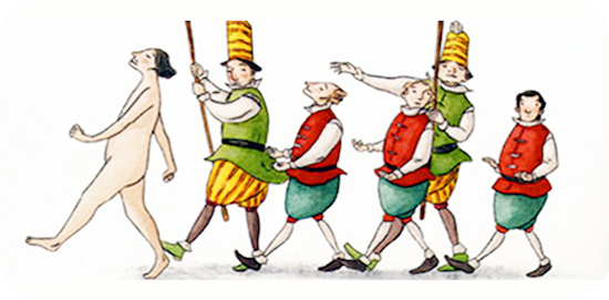
a) They cry in despair what is going on, denying what is presented to them completely, because The Emperor’s New Clothes are simply non-existent. At the same time they wonder how their business will be in shape after they went through this thunder storm.
b) They behave like under „stockholm syndrome“ influence: they know they live an abusive relationship and they try to find stuff which makes up for some positive reasoning behind all this. In the end they need to earn money for a living and most of the developers I know live the Lock-In into Apple’s platform wholeheartedly.
What’s the whole picture?
As far as I can see, the changes in iOS 7 are so massive that I have lost hope this will be changed in the final release. There is the huge misconception that users want the statusbar to show their content interfering with the encoded information on it (it is already a compromise when you display image/photo content). Then there is the misunderstanding that translucent layers do help in any way to give users some pseudo-depth-impression on a small device like the iDevice. The basic question is why at all doing pseudo-depth on this device? Why not be authentic and show, what needs to be shown in a readable manner. Now we get unpredictable background for navigationbars, tabbars and statusbars, even alerts and sheets. Seeing the Helvetica-font or whatever font that is all over the place makes my eyes cry. It is considerably less readable. Older people will feel a huge amount of discomfort reading stuff, but hey, we now have a new switch to just correct this in „Accessibility“-settings, great! Tableviews removed the frames for grouped tableview style which leaves content unstructured. If you have a look at the new contacts app you will recognize how your eyes search for some structure to orient themselves to, but this structure went away and instead you now scan for where text starts. There is a famous quote by Rene Magritte an artist for painting pictures, he said „A picture without a frame is not a picture.“ You could counterargue „Well, iOS is not a picture it is an OS.“ but Magritte meant framing content matters and it is a deeper concept for everything. A line is a border which tells you there are two different things sitting in front of your eyeballs. All these lines and borders have been removed now in iOS 7. It is no longer a valid picture because content is not bordered anymore. Borderless stupidity!
Redesign-improvement-myth debunked
Update: 15.6.2013
I just couldn’t resist to mark the problematic stuff on the screenshots of iOS 7 I have seen on Apple’s website. Feel free to comment.
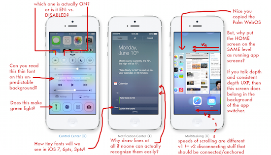
Debunking Part 1
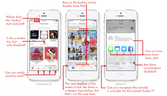
Debunking Part 2
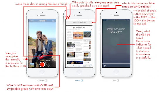
Debunking Part 3
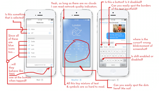
Debunking Part 4
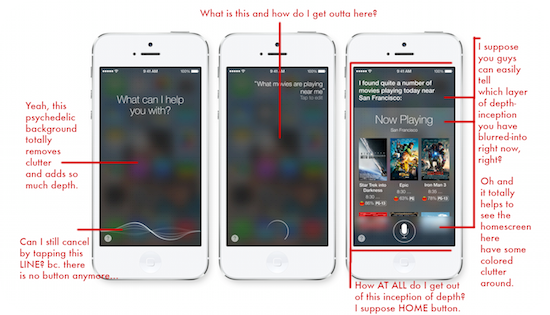
Debunking Part 5
Update: 19.6.2013
Just added these screens and updated all existing.
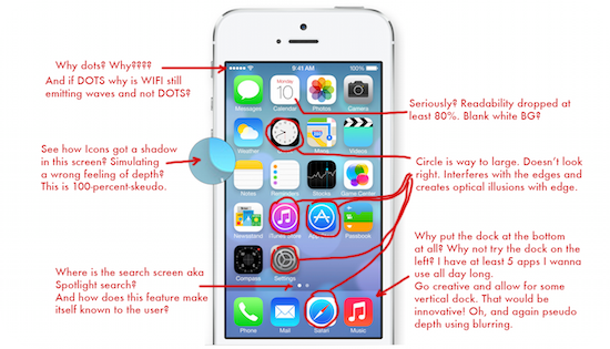
Debunking Part 6
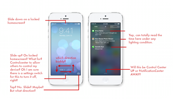
Debunking Part 7
Update: 26.6.2013
I found a really nice comparison of an iOS 6 vs. iOS 7 app project. Yeah someone really was THAT fast porting his own app. See what tapity.com has done with the Hours app.
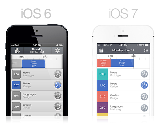
Source: http://tapity.com/iphone-app-design/responding-to-ios-7/
The only left rationale…
…seems to be „Go. Terraform.“ and that’s what I will do because I do not want to loose my business in 3 months. Lesson learned as a developer. Lesson learned from capitalism. MUST ADOPT CHANGE. MUST ADOPT CHANGE. MUST ADOPT CHANGE. So go, terraform…
Nice attempt to explain the new colors of iOS 7
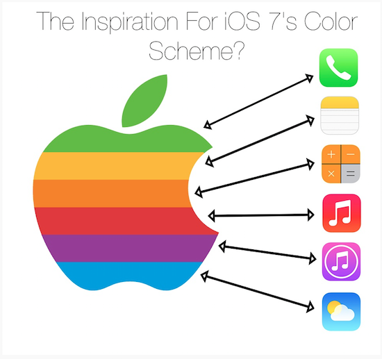
Source: Reddit http://www.reddit.com/r/apple/
Nice attempt to explain the icons of iOS 7
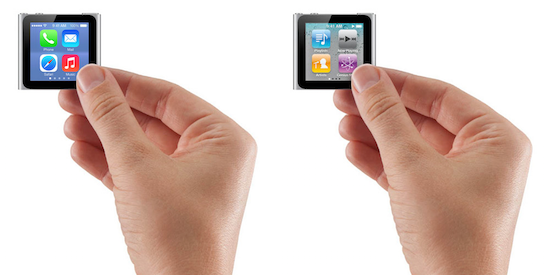
Source: codeintolight.tumblr.com http://codeintolight.tumblr.com/post/54345993747/clarity-i-decided-to-see-how-the-ios7-interface
I am not a “designer“ and I always choose clarity above style when I have my App Director hat on. Notice how the overly enlarged Safari circle, which some have called wrong, actually works really well in this particular situation.
I imagine this would hold true for a large wall hanging display too.
Future of business on the AppStore in Post iOS 6 Era
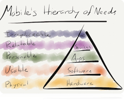 Today found another piece of really worthwhile reading on the interwebz through @obreidenbach (who you may know via famous products like iStopMotion and Boinx TV), a 3 part serie of analysis by Ben Thompson from stratechery blog why Apple sacrifices sustainable businessmodels for 3rd party developers and in the end damages itself – i.e. the platform – by doing so. But read on your own:
- Part 1: Papering Over App Store Problems
- Part 2: Casual gaming is sustainable, but not a differentiator & Additional Notes on Casual Games
- Part 3: Why doesn’t Apple enable sustainable businesses on the app store?
I see a lot of stuff in these 3 parts I would agree on. Another worthwhile article is „MOBILE’S HIERARCHY OF NEEDS“, from Ben. Reading about the hierarchy of needs, you could think of iOS 7 eroding the „Software“-layer which determines Usability and at the same time eroding the „Apps“-layer because a lot of the iOS 5/iOS 6 apps will soon get to hear the death knell on iOS 7. To actually level up to „Services“, all 3rd party developers would need a reliable service-backend, which iCloud (with CoreData) is definitely not, but parse.com has a lot to offer here in my opinion. Also not eroding the lower layers should be in Apple’s first and foremost interest.
After reading all this, I am really keen on how Apple will handle the transition of Pages and Keynote for iOS, i.e. new Apps or In-App-Purchase? Because Paid-Upgrades are not available to them either.
Rip. Mix. Burn. iOS 7.
 Innovation for iOS 7 seemed to have been done by remixing a lot of stuff that was already there. Therefore the following article is not very surprising: „Tracing iOS 7’s influences: Apple remixes almost everyone in the industry“:
The new interface, devoid of leather, felt, and stitching, invites comparisons with Microsoft’s “Metro” UI found on Windows Phone and Windows 8. Apple has played a game of design catch-up to some extent, adding settings toggles, a simpler multitasking interface, and swiping gestures to its OS.
So the once proposed motto of „Rip. Mix. Burn.“ which introduced the Digital Lifestyle Strategy somewhere around 2002-2004 just continues, but now does some mixing, too. Copy the best I say.
Nice one: Going pure iOS 9.
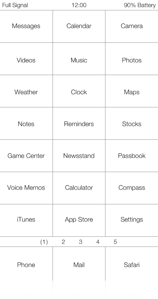
Source: https://twitter.com/sentry_nc/status/353473219921051648
Tweet done by @Sentry_NC:

 Great stuff, sooner or later we will get a nice console style device like we all wanted to see the content of the machine in zeroes and ones, like in MATRIX ya know?
Update 13.7.2013
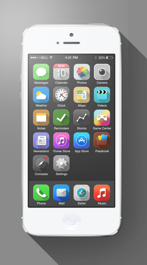
Yay, a design concept that recognizes position of the sun. That’s what really was missing…
Source: Sanat Rath
Well, „Notes“ now looks like a Pac Man Ghost, and „GameCenter“ got the Hippie Look™ finally. It would well fit the first iMacs with translucent polycarbonate with flowerpower patterns. Well „Compass“ now looks like my knobs for the kitchen oven and „Stocks“ looks like a mega-sharing button (hell ist has one connection more than standard sharing buttonts right).
Oh and did you guys recognize how baby customers react to the new iOS 7? Watch an learn Cupertino:
The frosted glass indicator for innovation
 Does someone still remember Windows Vista with the Aero-themed GUI? iOS 7 looks a lot like this but now it’s called frosted glass effect. On Windows Vista only the window frames and certain special windows applied a frosted glass effect on the background. It’s worth noting that this effect only worked with powerful graphics cards really well, because realtime computation of image data is something which needs permanent power, power the CPU could not provide. Andreas Goeldi nailed it for me here:
When a technology vendor can’t keep up with the speed of innovation anymore, it resorts to incrementally copying other’s innovations and starts adding pointless visual gimmicks, such as frosted glass effects. Such effects are cool, set your product apart, make it look modern, but unfortunately they are also entirely useless and just consume system resources without really improving the user experience.
I ported my first app over to iOS 7 today and I am really underwhelmed by the default results you get when you develop a UI here. The frosted glass effect does get into the way of nearly everything. You really have to take into account the right tintColor for the whole app upfront e.g. because this has dramatic effects on readability of important elements like e.g. segmented controls. It is also difficult to decide if a font should be displayed rather in black or white color, because the burry background of frosted glass may become too bright if the background is bright and it can become too dark if the background is dark. This is a real problem! My subtle feeling is that we should no longer use navigationbars and toolbars at all. because if you do they will look awful if you leave them as they are by default (frosted glass). For me iOS 7 will be the historic Bitter-Sweet-iOS-Release which breaks with everything of the past. I think different now about Scott Forstall and I really hope he will come back sooner or later.
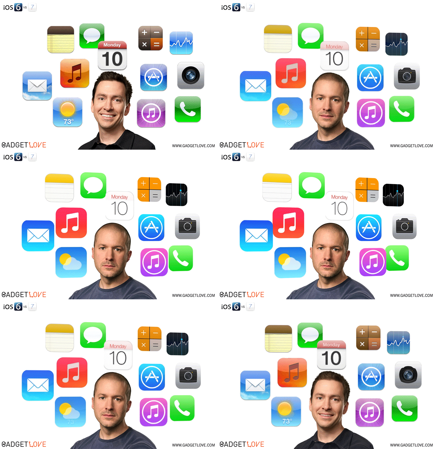
Motion Sickness
A new issues arises now that iOS 7 is out in the wild: Motion Sickness. iOS 7 is supposed to trigger vertigo and nausea symptoms. Usually you know this phenomenon known as Motion sickness, kinetosis and as travel sickness. It happens e.g if you read a book while sitting in the car or bus, or sailing a boat on the sea. But it often also arises in 3D first person perspective games.
I personally know that phenomenon well. I have motion sickness while reading on a bus/car and in 3D first person gaming. Usually it is strongest in 3D games which allow for fast rotational movements from a first person perspective. When that happens to me the effect occurs even after 20 seconds of looking at this. But the really bad thing is that it lasts very much longer. I have luck that in 3D (Real 3D Cineam) movies I am not hit by this and I loved Avatar so much I went there three times in a row.
Looks like many people have the new animation effects in iOS 7 triggers exactly the stuff you usually avoid when you suffer motion sickness. I think Apple will take care of this and offer a „Less motion“ settnig quickly, though haven less motion right from the beginning would have been more Apple-like. I totally expected this when I saw what happened to all the UIKitDynamics stuff presented at WWDC. It’s like the first PowerPoint which offered effects to „enhance“ your presentation. It has such a huge addictive drag on many people that just cannot withstand the magic of movement.
Evolution also taught or reptile brains that everything that moves could be a potentially dangerous thing, which is why these effects guarantee attention by the user. You cannot just look away, the reptile brain recognizes movement and extracts „danger“. That’s how all moving advertisements on our websites work. The bad thing is, that or reptile brain couln’t be more wrong in that this stuff needs attention. Why should I spend my attention on a zooming out folder? Why should that be dangerous? Well, million of year old brains… they just don’t fit into our current time and yet they determine how we react. Motion sickness is just the consequence of some FAKE MOTION. We went from SKEUDOMORPHISM to SKEUDOKINEMATICS. Well done! Let’s see what customers prefer more in the long run. Do serious people still make inflationary use of PowerPoint effects in slides? I don’t think so. I hope we will see corrections on the whole iOS 7 thingy.
In the meantime you could test if you are suffering motion sickness by watching this video:
Icon Corners
Round corners belong to Apple as the Apple symbol itself. They were around on the first Mac and also on the first iPhone. They went away someday on OS X (noone knows why, perhaps because it is more work to handle round corners if you need to manage multiple screens). But what now happened to iOS 7 icon corners can only be called ridiculous. And people really wanna find out about it.
Like Mike Swanson who is „Unleashing Genetic Algorithms on the iOS 7 Icon“. And this is what he found to be the new round corner of the icons under iOS 7.
Source: Unleashing Genetic Algorithms on the iOS 7 Icon
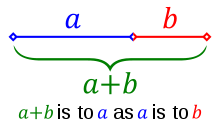
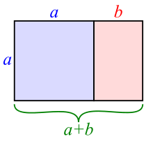
I mean, yeah, round corners are a thing which accompanies Apple a long way now, but these „round“ corners… I started remembering the Golden ratio. Do you remember it?
| Line ratio | Area ratio |
|---|---|
 |
 |
Sloppy UI – the end of attention to detail
sloppyui.tumblr.com says it all. Well and this Icon analysis.
"Apple has demolished millions of hours of user learning by changing the icons."
![]() RALUCA BUDIU from Nielsen Norman Group has analyzed the iOS 7 changes in usability and user experience in this article with the title „iOS 7 User-Experience Appraisal“. Though several improvements are detected in iOS 7 (e.g. Global font-size control, as far as apps support them), the overall result was that early redesigns of apps for iOS 7 are less likely as easy to use as their iOS 6.x counterparts and swipe ambiguity in several places increased overall risk to initiate unwanted interactions accidentially.
RALUCA BUDIU from Nielsen Norman Group has analyzed the iOS 7 changes in usability and user experience in this article with the title „iOS 7 User-Experience Appraisal“. Though several improvements are detected in iOS 7 (e.g. Global font-size control, as far as apps support them), the overall result was that early redesigns of apps for iOS 7 are less likely as easy to use as their iOS 6.x counterparts and swipe ambiguity in several places increased overall risk to initiate unwanted interactions accidentially.
From my point of view they actually nailed it especially with the result of „Apple has demolished millions of hours of user learning by changing the icons.“ because I find myself still searching for the photos app ever and ever again searching for this yellow sunflower which is not there anymore. I would like to add that Apple also demolished millions of hours of developer engineering, that’s at least what I found when going into transitioning my own apps. Nevertheless actually I started to make even more use of spotlight since iOS 7 decreased costs of initiating a spotlight search, so finding an app quickly is now stronger related to a good spotlight search result than a nice icon.
New theory: Was iOS 7 built with Microsoft Word
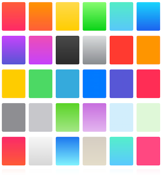
More solid base of colors
Need some new colors after every simple color now looks like it came from a thousand years ago? Then try http://ios7colors.com. You can have any color as long as its a gradient. Oh and these jumpy little gray dots between the colorplates below… they are for free.
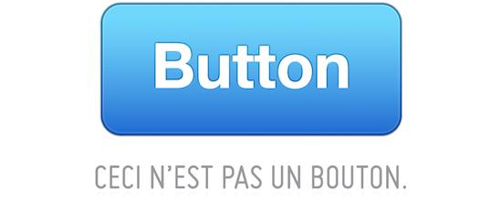
There is no spoonbutton
JARED SINCLAIR has written a really nice rant about iOS 7 and its no longer available buttons headlined „Untouchable“
I could not agree more with this:
For buttons, touchability requires something different. Touchable buttons need borders. By “borders” I don’t mean outlines, (although outlines are included in my usage of the word). I mean borders in a broader sense. A button is a tappable area, clearly delineated from the un-tappable content around it by an obvious border.
How would the Alien icons look like as redesign in iOS 7?
Well, this question was raised by Dave Brasgalla (from iconfactory) and he found a smart looking answer:

Source: „iOS 7 and the Iconography of ‘Alien’“
Well, those icons really look great. They all have a consistent colorscheme, they have ‚real‘ iconic attributes (specific shapes, borders, areas, etc.) and they all are quite abstract from stuff we know. That’s what makes them special/different compared to iOS 7 from my point of view. The work!
I often thought about how all this redesign-frenzy would have played out, if reduction would have been taken one step further: going black and white only (or tinted untinted if you like that one better). I mean all these fancy gradients destroy the approach to make the icons gain simplicity from their attributes of shape. We will see… in the end it is just a phone. Perhaps the next inspiration for a UI change should have a look at how the best game UIs work, those always bypass all changes of the OS by bringing there completely unique UI to the table. I like that!
Why Apple’s iOS 7 redesign might not be good news for users
That’s what a new post by Chris Mears of The UX Review is about where he writes here.
Just one quote:
Ultimately the problem with design refreshes purely for the point of making something old appear new is that they rarely leave any lasting satisfaction beyond an initial “oh that’s new” factor. Any design refresh has to support an enhanced experience in order for it to be time well spent.
While I see that flat has some appeal I would never let UXP suffer in favor of some fancy classical conditioning combined with novelty effects as stated by Mike Redaelli in his „Flat design vs. skeuomorphism“. He claims for iOS 7 novelty effects will be the only lasting effects which is a pity.
How about this? The Dot Grid?
Dot grid HUD UI
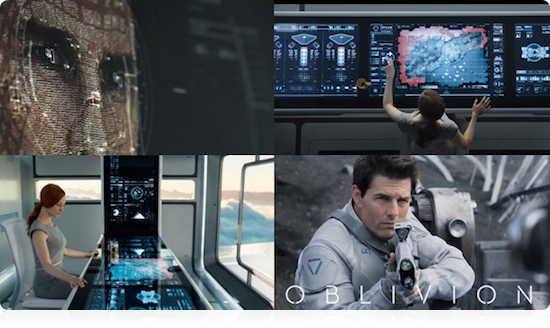
The Huds and Guis has a nice post about this.
YAUXPS – Yet another UXP site
The site uxcritique.tumblr.com collects some new but also a lot already known design flaws of iOS 7. Well… for me the issue presented in november just looks very much known already. ControlCenter and its buttons(?) how do you call this stuff now? Are they still called buttons?
iOS 7.1 – keep going terraforming
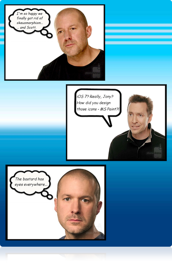
Yeah, iOS 7.1 what should I say. It is the last time you will see me putting my critical view on this 7.x releases. I lost all hope on this. Apple’s reaction to the user feedback resulted in lots and lots of switches in the „Accessibility“-settings where you can now adjust nearly everything. Instead of doing it right, they now do a-1000-things. Great! From cream-to-crap in nearly no time. I now have an idea why they fired Scott Forstall. But well… at least we now have a first help-screen on some of the issues of iOS 7:
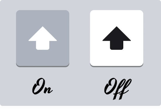
See ismyshiftkeyonornot.com for more. It basically reminds me of the „Mighty Lichtschalter 2.0“ a similar piece of excellence in engineering.
Update: Find a proposal what to change in keyboard design.
Conclusio (just in case any Apple employee did read this far)
Just go read this and this. Then go back to the drawing board for iOS 8. Thank you!
Just some important excerpts (pls replace User/Users also by Developer/Developers, thx!):
Users don’t hate change. Users hate change that doesn’t make their life better, but makes them have to relearn everything they knew.
“Having a strong sense of controlling one’s life is a more dependable predictor of positive feelings of well-being than any of the objective conditions of life we have considered, […]”
The moment you succumb to the notion that “users just hate change,” you’ve ceased designing for your audience.
The No. 1 Contributor to Happiness says Karen Salmansohn, is „autonomy“ – defined as „the feeling that your life – its activities and habits — are self-chosen and self-endorsed.“
So speak after me:
Researcher Angus Campbell emphatically endorses the perks of autonomy. „Having a strong sense of controlling one’s life is a more dependable predictor of positive feelings of well-being than any of the objective conditions of life we have considered,“ says Campbell.
A University of Michigan nationwide survey also sings the praises of autonomy – reporting how the 15% of Americans who claimed they felt „in control of their lives“ also raved about having „extraordinarily positive feelings of happiness.“
More Tint
Oh look Manton Reece has something to say about Tint color misuse.
It has been nearly a year since the first iOS 7 beta, and something about tint color still bugs me. In fact it bothered me enough at the time of the early betas that a filed a bug on it with Apple, something I very rarely do. The problem isn’t so much in the concept of tint color, which I like; having a consistent color for buttons and links, especially now that buttons are so understated, makes a lot of sense. The problem is the implementation in apps that use tint color anytime they want to highlight something, whether it is tappable or not.
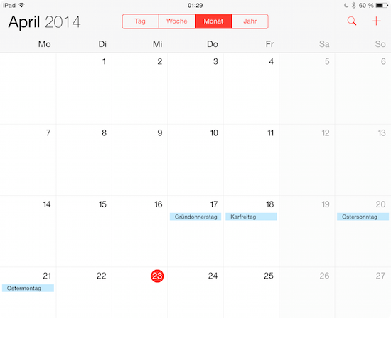
Here’s an example in Apple’s calendar app. It uses a red tint color for buttons, but it also highlights the current day with a round circle using the tint color. It looks tappable, but it’s not.
Well, for me personally tint color is not so much an issue as all those undiscoverable buttons, eh… links… eh texts which might-be-tappable-but-you-have-to-tap-them-to-find-out.
Oh look, blocks
A nice idea! Someone dropped his resume publicly so Apple can hire him.
I am not convinced yet that this will add to the overall simplicity or UXP. For me „Lively Status Icons“ would be much more helpful… so icons of Apps communicating their inner app state visually by manipulating the icon in realtime (like the clock and calendar already do). Predefined icons of state would also resolve review issues of apps faking identity mimicing icons of other apps.
And the hope never dies…
From iOS 7…
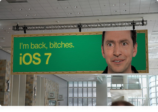
Source: http://www.idownloadblog.com/2013/06/17/jony-ive-svp-design/
to iOS 8…

Source: https://twitter.com/AndreaCervone/status/472460937891680258
to … let’s wait for iOS 9.
Just for the records of history
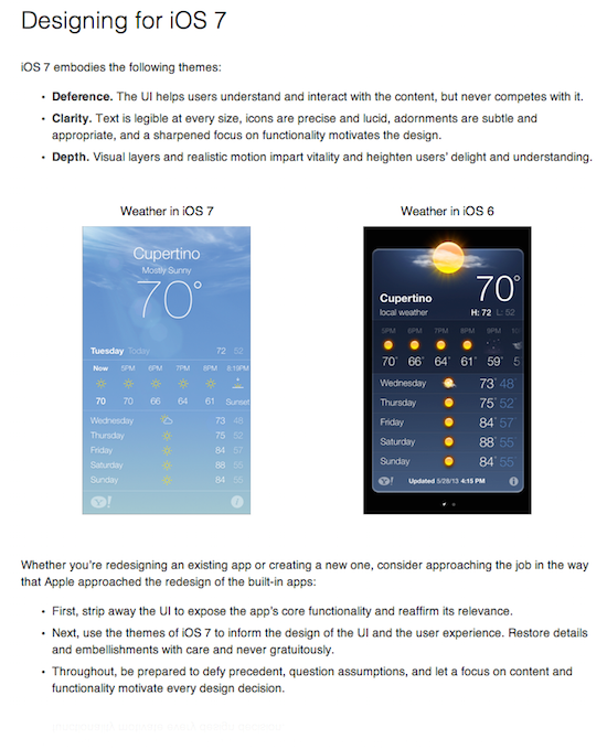
Source: iOS Human Interface Guidelines
And this reminds me of following text when I think about all the useless semitransparent frosted glass effect all over the whole ballpark…
to abstain completely from teaching or defending this doctrine and opinion or from discussing it… to abandon completely… the opinion that the sun stands still at the center of the world and the earth moves, and henceforth not to hold, teach, or defend it in any way whatever, either orally or in writing. (from The Inquisition’s injunction against Galileo)
Source: Wikipedia about Galileo affair
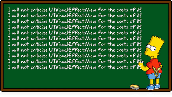
Source: Bart Simpson Chalkboard Generator
The new high in low… Yo!
I really cant stop laughing right now… have you heard about Yo!?
You will soon…
The simplest & most efficient communication tool in the world.
Yo is a single-tap zero character communication tool.
Yo is everything and anything, it all depends on you, the recipient and the time of the Yo.Wanna say „good morning“? just Yo. Wanna say „Baby I’m thinking about you“? – Yo. „I’ve finished my meeting, come by my office“ – Yo. „Are you up?“ – Yo.
The possibilities are endless. We don’t want your email, Facebook, there is no search, no nothing. just Yo. Open the app, tap Yo, that’s it. It’s that simple. Yo.
There is one quote from CNNmoney I cannot leave unquoted:
Yo has garnered $1 million from investors according to its creator, Or Arbel.
Isn’t this great? Oh and just for the records. The new standard in icon design is now this:
Yeah! I suppose you cannot argue with this design. Why color? m(
Low-Contrast Text Is Not the Answer
The Nielsen Norman Group has an eye opening article on text and constrast. The key message from that article:
Low-contrast text may be trendy, but it is also illegible, undiscoverable, and inaccessible. Instead, consider more usable alternatives.
Now, NN Group usually only deals with websites, so they found significant the flaws in Apple’s new, all-flat Website. But if you pay attention to iOS 7, 8 & 9 … well… UIVisualEffectsView is one prominent example of a new way Apple creates unreadable, low-contrast text now. It really is a pity if you check all the places in iOS which are powered by low-contrast text „because design“.
Update December 2017
Things like APPLE IS REALLY BAD AT DESIGN (Depublizierungsschutz) are popping up.
Why do I blog this? I belong to those developers who see their business in danger. I belong to those which wanted to push the limits on the next app iteration but can now screw this because they need to transition or go out of business. I belong to those which will never ever go the stockholm syndrome path. I blog this because I think Steve Jobs would have never let this happen. He would have thought of developers and customers alike and spin off changes from those two points to start with. And he would have never let it happen to put beta (not yet camera ready) screenshots on the public company website. That’s a first in 2013. I will happily blog about all the fantastic stuff that was improved under the surface and in the SDK but that’s under NDA by now. I know that iOS 7 is declared as a beginning of something new, but why bother the customers with something that is not yet ready? Why? I am able to see the target which was giving direction for this move, but I think the stuff is far from done. If this is the beginning, then I would like to see some significant progress…
…perhaps some of the words I chose above are a bit emotional, that’s due to the fact that as a developer you identify very much with the products you build. I know that actually I should also be thankful to Apple for creating this market and these possibilities to make a living from it. And I am! Nevertheless I am concerned about the things I see. I see a lot of rocksolid innovation in the SDK I cannot talk about because of the NDA and that makes me confident, that somehow Apple has all the tools to create an excellent upcoming iOS.


Hmm…. iOS7 is starting to mimic Windows 8 in icon & color motif.
I think we already have enough W8 in the world already, thanks.
– A W7/Android Custom ROMs user
P.S. Although… the realtime shadows *are* an interesting idea…