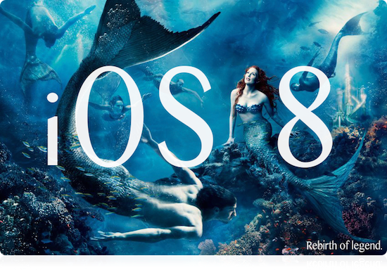
Source: http://rococovintage.blogspot.de/2010/04/fishes-in-trees-or-what-is-left.html and http://realitypod.com/2014/02/annie-leibovitz-disney-films/
Since WWDC will start tomorrow, I will just trow in my guesses or wishes or expectations on iOS 8. Since I did this already last time iOS 7 was in the process of being shaped, I will continue on this procedure. But I change something, I will make a table to more easily check off the stuff that was implemented / realized.
| Features & Fixes expected |
| Feature/Issue/Wish |
Done/Fixed? |
Simplified Contextual Settings
Have all the settings related to your app in ONE contextual ViewController which is the same style & look & feel everywhere. This thing may feel more like the NotificationCenter. But having Settings distributed and hidden in a thousand places is just frustrating. Plus the Settings app is now an overloaded bloated monster controller. |
 |
Siri API
Siri is a hell of a nice technology piece. Being able to give commands with spoken language sometimes is a real benefit. To integrate Siri commands, Apple needs to provide a kind of API where an app can announce certain spoken commands it will react to. Think e.g. the Photo App to make a photo by just listening to your voice. It has to announce the magic command and then we just switch on iPhone’s LISTEN & ACT functionality (like in STNG the communicator).
|
|
Day & Night Mode
Apple should add the possibility to apps to support a day & night mode. Apps then will be able to adapt the UI to environmental lighting conditions. Basically this will mean make more use of UIAppearance but it also involves some solid detection of stable lighting conditions. Also it would be great to have the condition of Extrabright/Sunlight mode, where contrast gets enhanced in a certain way automagically. This is an urgent need especially now after we got a whole lot of more white areas on the screen with iOS 7. This is much too bright in the evening and you have to dim the screen to not hurt your eyes if you open up e.g. tweetbot in the dark. Alternatively give us developers access to the lightsensor values to adjust the UI.
They added this to OS X first (black & white). Surprise, surprise.
|
 |
Lively App State Icons
Apple is doing this with Calendar App and Clock App already. So it is tested functionality already. To make it work for the masses we need to make it work in the review process. So added different state icons to the review would be such a great thing. Apps running in the background could define to display certain app icons to communicate the inner state without the need to open the app. I want that since day one of the iPhone and iPhone OS 2.0!
|
|
Marking & editing text with the finger
It’s awful, it could be much better. There do exist picture perfect concepts of how to fix this. CAN WE PLEASE HAVE THIS CONCEPT BECOME A REALITY SOON? Apple Engineers please see also this tweet.
|
|
Important System Settings in NotificationCenter
I dislike ControlCenter, kill it please. It interferes with the scrolling process way too often. Just put all this stuff in NotificationCenter please. There is a perfect picture of how this should look like here.
|
|
iCloud Transparency
Please be transparent, WHAT actually goes into the cloud. And please leave iCloud off by default. I do not want stuff to be copied to the cloud unwanted. This is important to me. If I want iCloud to be on, I would like to see WHAT and how MUCH of it actually goes there. Please enforce transparency on this for your own apps and those of all developers.
|
|
Encrypted E-Mails (Default-ON)
Some way to easily encrypt all my E-mails and attachments would be a really great idea. But actually Apple now is more involved in rolling back security in Mail. |
|
The power cable & charging process
Every device needs power. Nearly every day. Why the hell do iPhones, iPods and iPads switch themselves ON when they were put on or are cut off from the power cord? What’s the reason behind this? Fix it! Leave it off please. Thanks! |
|
The-one-Icon-too-much Situation
Everytime I reorder my Apps on the Homescreen, it gives me a headache to move these dumb little things in a way they not accidentially destroy the complete order of ALL following panels. If I place a new Icon/App on my FULL homescreen the last icon gets pushed to the next screen, which leads to the following panel pushing its last icon to the next, and to the next and to the next… +bingo+ we have a cascading effect here, but that is not what I want. Please push this Icon in some “Parking Slot”, from which I can move it to its new position easily. Please, fix that soon! |
|
RAM Degradation aka Memoryleaks
Many people do not restart their phone for months. But during this time OS daemons and other stuff leak memory continuously. This leads to significantly less available memory for apps and their execution. Please force free leaked memory with some procedure which is friendly for customers. You could e.g. restart certain system daemons during NO-USE-TIMES (e.g. the night, when customers are asleep). Fix it! |
|
Battery
If you guys have the choice of making this thing thinner again or giving it more LI-Batterypacks, please go for the more electrical power approach, please!
I count this as a YES, because you can now see which app uses how much battery. |
|
Multi-User and/or Guest Environment
It is not so much an issue with the iPhone than with the iPad. The iPad invites to be passed around for gaming, photos and so on. At least it would be great if I could have a GUEST-mode where no Push-Notifications show up, none of my Apps is used by the guest with my documents/accounts/favorited links and so on. Even some YOU CANNOT leave this app without my permission/password-mode/switch would be helpful. |
|
YAARS (Yet another aspect-ratio screen)
Yes, I like variety, I like happy customers, but I do not have unlimited resources to support app development or maintenance. Supporting any new aspect-ratio is costly and adds to the overall amount of work needed to build an app. Just try to be conservative here, please and do not introduce new aspect ratios. |
|
Support for second screen e-Ink-Displays
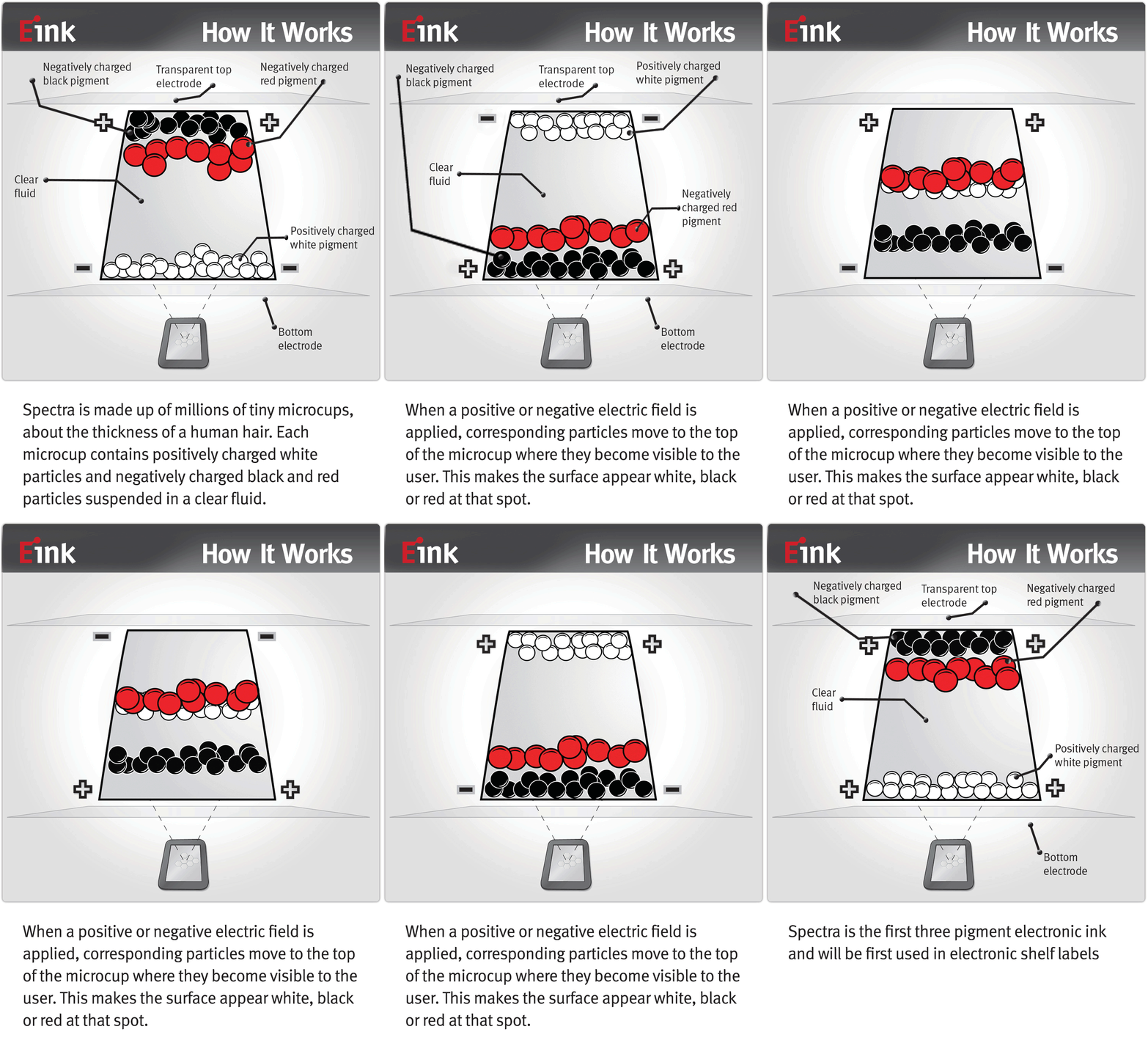
This wish goes hand in hand with my wish for a simple yet touchsensitive e-Ink device. I still miss a device from apple to read my eBooks on AND (and this „AND“ is important) where I can make annotations to text in RED color. There does already exist e-Ink in 3 colors. That is all that is necessary. Make iBooks a completely stand-alone-device AND make it capable of using AirPlay as second screen output medium. This second screen is why I want e-Ink-UIAppearance Support. So I can build viewcontrollers to output stuff on e-Ink displays/second screens. This would also overcome the limited visibility of screen content in bright sunlight. |
|
Countdown WWDC 2014
Now lets wait for the show to begin…
Click to see countdown…
Predictions
I just want to add some predictions to make things even funnier here.
- Sparklines will rise to new poplularity in all kind of apps 100% CORRECT, look at Healthbook
- The bulky, 3d, skeudo navbar on Apple’s website will become flat 100% WRONG, it’s still there.
- Several other iDevices will get the fingerprint-sensor 100% WRONG
- OS X Finder will be the same piece of cr*p after full recoloring-frenzy of OS X 10.10 WE WILL SEE…
- Pasteboard sharing between OS X & iDevices will become standard (think „Pastebot“ stev’d) 80% CORRECT, we got AirDrop now!
- Settings App will get even more crowded with more fancy knobs, sliders and endless lists (internal codename: „will-o-the-whisp“) 100% CORRECT
- A supersecret deal with creditcard companies worldwide will activate iPay for all iDevice owners; adding iShop In-App-Shopping for anything and instant pay via iPay to ANY app in the ecosystem. 100% WRONG, this time!!!
- Helvetica Neue will become default System Font 100% CORRECT
- OS X will copy Windows frozen glass effect all over the ballpark 100% CORRECT
- iTunes won’t go away or be split in several apps 100% CORRECT and that is why I switched to VOX completely.
- Apple will chime into bigger is better and release an iPhone with even bigger screen (because sayin‘ no you know) 100% WRONG
- Dr. Dre will call out to Snoop Dogg, Eminem, Xzibit, 50 Cent to really get the party started… to later let Eminem perform „I need a doctor.“ to underline he himself has no real doctorate degree, and Apple Dev audience & Tim Cook will need one anyway after their performance during the keynote will be completed. *justkiddin’* 100% WRONG
- More to come…
Why do I blog this? I want to keep track of things. So I transferred all open issues from my former blog post „iOS 7 – what I would expect it to fix“ which are still open and added some new. Please recognize that I have given up on UI issues related to the new flat world and the non-existent buttons. I simply lost hope on this thing. But hey let’s see how well non-buttons will go on OS X if they do the full 100% recoloring of OS X in iOS style… *praying for this not to happen right now*
… btw, did you recognize my curvy design of the „8“ in the fake-„iOS 8“-banner I created? It refers to the nice woman next to the 8. It plays with the beauty of female shape. I wish Apple would allow itself to refer more to the full spectrum of human aspects in it’s design. We are no machines or robots. We love human shapes and asymmetric stuff. It feels much more natural to us.
Update: I added the music which would best fit iOS 8 if I would have released it.
Oh and by the way, I know Apple is building something that is as impressive in regard to overall design that will look much better than iOS 7 and iOS 8 together: Apple Campus 2. Though here in Europe you would say „This is just bricks & mortar“ I say this lays foundation to new ideas. I mean, I would really enjoy to be even a part time resident e.g. for 3 months or so in this kind of place. It must be great to work at a place so thoughtfully designed.