…zumindest für Beträge die einen bestimmten Wert (sagen wir 15 €) nicht überschreiten?
Soeben habe ich mir einen Artikel der stiftung warentest gekauft mit dem Titel „Wetter-Apps: Sechs von acht kritisch beim Datenschutz“ (mehr dazu hier). Im Internet. Mit dem Smartphone. Und oh Wunder, es funktionierte.
Mobiltelefonnummer angeben
SMS bekommen mit einer TAN
TAN eingeben
Fertig ist das DRM-freie PDF zum lesen
So, liebe Zeitschriftenverleger muss das funktionieren. Problemlos, schnell und vor allem ohne Registrierungsirrsinn. Hätte ich bei der Stiftung Warentest erstmal einen Account anlegen müssen, hätten die das vergessen können mit dem Kauf. Prima so, danke!!! Mögen sich alle anderen recht bald ein Beispiel daran nehmen.
Why do I blog this? Nun, ich bin die elenden Zahlungsregistrierungsformalitäten leid. Das eingeben einer Mobiltelefonnummer – die wie wir ja wissen die NSA sowieso schon kennt – erscheint mir da noch mit das kleinste Übel. Sofern die Telefonnummer nicht für das Versenden von SPAM-SMS genutzt wird danach ist das ein super-easy Zahlungsweg. Schön wäre ja, wenn mein Mobilfunkanbieter eine Payment-ID anbieten würde. Die gebe ich dann bei solchen Sachen ein und die Stiftung Warentest erfährt dann gar nicht meine Telefonnummer, sondern nur die Payment-ID.
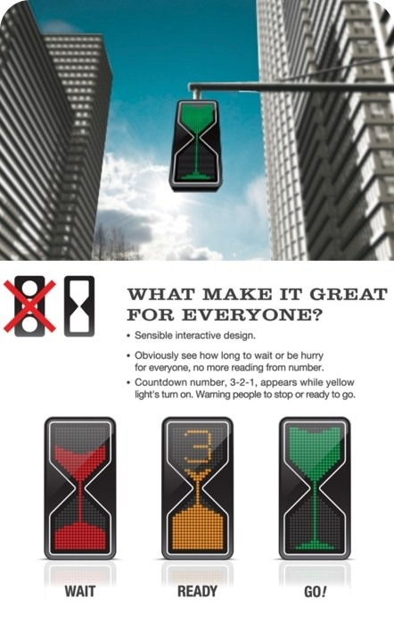
Zunächst mag das toll aussehen. Innovativ denkt man sich. Und eine Sanduhr das kennt jeder. Prima Sache! Doch dann kommen die Fragen…
Was haut nicht hin dran?
Farbsättigung rausgenommen (Simulation von Farbenblindheit)
Sowohl das GO-Signal als auch das WAIT-Signal sehen sich strukturell sehr ähnlich. Lediglich die Farbe dient als Unterscheidung, und das reicht nicht aus weil es auch für Farbenblinde funktionieren muss.
Das READY-Signal ist völlig unklar. Heißt das jetzt ich habe noch 3 Sekunden zum fahren dann springt es auf WAIT um oder heißt es in 3 Sekunden geht es los auf GO? Das wesentliche Merkmal der bestehenden Ampel, OBEN ist immer WAIT, MITTE ist immer READY und UNTEN ist immer GO, stellt jederzeit sicher, dass man weiß welches Signal anliegt. Man sollte nicht nachdenken müssen bei sowas!
Fazit: Lustige Idee aber gänzlich unbrauchbar.
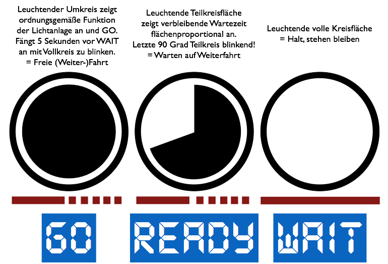
Idee: Wie wäre es mit einer EIN-LICHT-AMPEL
Wenn man schon was verbessern will, warum nicht vereinfachen und EIN Licht verwenden? Das schein ja irgendwie auch die Absicht des obigen Designentwurfs gewesen zu sein. Das spart Leuchtmittel, Gehäuse, verdeckt weniger Sicht und ist einfach zu kapieren ob Farbenblind oder nicht. Zeitinformation die bislang als gelbes Licht kodiert wurde (gleich wird es ROT oder gleich wird es GRÜN) kann man über BLINKEN kodieren.
Quelle: Eigener Entwurf
Ist für Farbenblinde geeignet, lediglich HELL-DUNKEL-SEHEN ist erforderlich
Signalisiert Statusübergänge (zwischen GO und WAIT) deutlich sicherer durch BLINKEN
Erlaubt klarere Kommunikation an den Wartenden wie lang es noch dauert bis er fahren kann
Reduziert den Leuchtmittelbedarf
Auch bei eine beschlagenen Scheibe, die einen Blur-Effekt auf das Ampellicht appliziert, dürfte der VOLLKREIS, das BLINKEN und der AUS-BIS-AUF-DEN-AUSSENRAND Betrieb gut erkennbar und unterscheidbar sein. Das dürfte bei der Sanduhr schonmal fehlschlagen.
Reduziert die durch die Anlage verdeckte Sicht im Straßenbild (nur noch eine Lampe, die weniger Fläche im Sichtbild verbraucht)
GO-Signal ist eine Lampe die fast AUS ist, was nah dran ist an KEINEM Signal, lediglich der Leuchtkreis weist auf ordnungsgemäße Funktion hin.
Update 9.8.2013
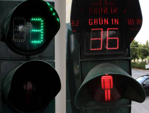
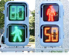
Heute schreiben die ZEIT un die bild über Experimente mit Countdown-Ampeln.
Zitat aus der ZEIT:
Verkehrspolitiker von Union und FDP werben dafür, Ampeln so umzurüsten, dass sie den Fußgängern anzeigen, wie viele Sekunden die Rotphase noch dauert. Das soll die Verkehrssicherheit erhöhen. […] Im Bundesverkehrsministerium stößt die Forderung nach Countdown-Ampeln auf offene Ohren. […]
Na das klingt ja interessant. Ich meine die zeitliche Anzeige gibt es ja schon jahrelang in den USA. Und schon melden sich Verkehrsexperten zu Wort…
Unter Verkehrsexperten gehen die Meinungen zu den Countdown-Ampeln auseinander. „Wenn man in Eile ist, weil man zum Beispiel seinen Zug erreichen muss, hat man oft den Eindruck, dass Ampeln ewig lang rot sind“, sagt Egon Stephan, Verkehrspsychologe an der Universität Köln und Mitglied der Deutschen Gesellschaft für Verkehrspsychologie. Eine Anzeige, wie lange die Ampel noch rot ist, könne da den Stress reduzieren. „Ohne diese Info sind viele Menschen zu ungeduldig und rennen einfach trotz roter Ampel über die Straße.“
Dem kann ich nur zustimmen. Transparenz was da in den Ampelschaltungen vor sich geht kann eigentlich nie schaden. Denn umso abgewogener und sicherer kann eine Entscheidung stattfinden (warten/losfahren/losgehen).
Berlin experimentiert seit dem vergangenen Jahr mit blinkenden Lichtsignalen.
Das klingt danach, als sei mein Entwurf weiter oben ja vielleicht doch nochmal relevant. Gibt übrigens international schöne Beispiele für solche Art Ampeln. Warum die allerdings immer auf die Fußgänger fokussieren verstehe ich nicht. Als Autofahrer interessiert mich das doch genauso.
Ebenfalls schön die Lösung mit vielen bunten Lichtern und der Klassiker aus den USA:
Dann warten wir mal auf die Revolution der Ampelmännchen:
Ampelgestaltung, das verkannte Kulturgut
Die vielen verschiedenen Ampeln weltweit müssen ja einen Grund haben. Ich denke mal es ist einfach ein Kulturgut wie Häuser, Autos, Steckdosen und Geschäfte. Jedes Land gestaltet einfach seine eigene Version davon. Überzeugen kann man sich davon auf der Internationalen Seite für Ampelmännchen. Hier mal eine kleine Auswahl von 4 verschiedenen aus Belgien, Singapur, Polen und Monaco.
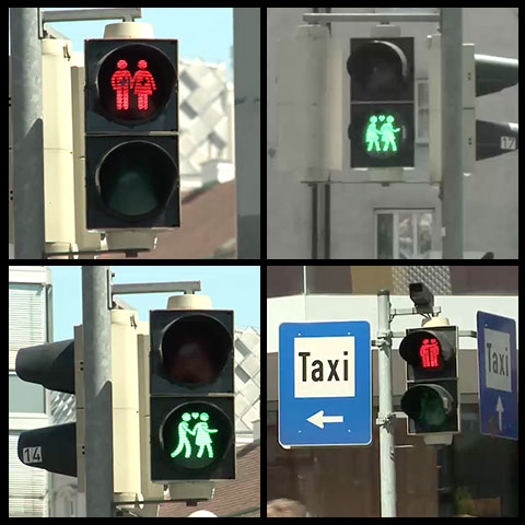
Wien testet neue Ampeln für Fußgänger
Die Stadt Wien arbeitet laufend an einer hohen Sicherheit für alle Verkehrsteilnehmerinnen und -teilnehmer. Ein Pilotversuch mit einer neuen FußgängerInnen-Ampel soll für höhere Verkehrssicherheit sorgen.
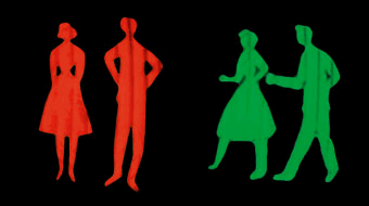
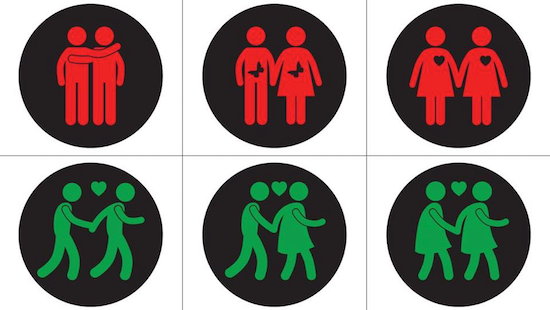
Das besondere an den neuen Ampelmodellen, sie zeigen mehr als einen Ampelmann und zwar Pärchen in der Formation Mann-Mann, Mann-Frau und Frau-Frau. Hintergrund ist eine Initiative der Stadt für mehr Toleranz und eine Kommunikation von Toleranz anlässlich u.a. des Eurovision Song Contest 2015. Leider werden diese Ampelbilder wohl nach diesen Ereignissen wieder zurückgebaut in den Ursprungszustand. Angesichts der viralen Botschaft die weit außerhalb Wiens zur Kenntnis genommen wird, haben sich die kolportierten Kosten von 63.000 € wohl schon vielfach gelohnt als Marketingbudget mit Viraleffekt. Und so sehen die neuen Ampeln aus…
Es gibt auch zwei Filme auf der Webseite des Beitrags (1,2Depublizierungsschutz)
Drei neue Sujets wechseln sich an den Test-Ampeln ab und zeigen in Form von Paaren an, ob Fußgänger_innen gerade „rot“ oder „grün“ haben. Da die Menschenrechtsstadt Wien in den kommenden Wochen – rund um LifeBall, Songcontest und Regenbogenparade – ganz besonders im Zeichen der Weltoffenheit steht, werden die Ampel-Paare die Vielfalt der Wienerinnen und Wiener zum Thema machen: neben Mann-Frau werden auch Männer-Paare und Frauen-Paare auf den Wiener Ampeln sichtbar sein.
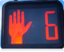
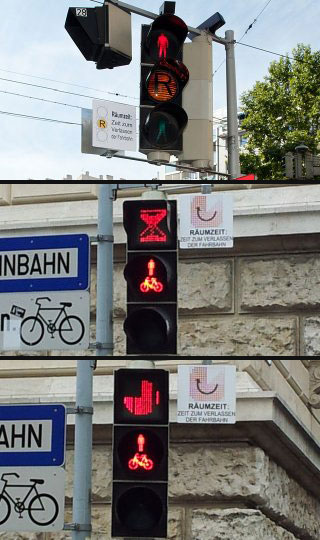
…gleichzeitig wird aber auch mit neuen Ampeln experimentiert die die sogenannte Räumzeit besser kommunizieren sollen. Und die sind ähnlich gestaltet wie Exemplare die ich weiter oben bereits erwähnte. Die sollen wohl auch irgendwann in den Regelbetrieb übergehen. Das sieht dann so aus…
Ich frag mich ja immer nur, warum wirklich jedes Land seine eigene Ampelforschung macht. Aber nun ja, zu Vielfalt führt es ja.
Branded Traffic Lights
Eine schöne Variante wäre ja auch mal, Ampelflächen für Werbung zu vermieten. Einfach Firmenlogo drauf und ab geht die Post. So ein schönes Microsoft-Logo für die Grünphase das wäre doch mal was, oder? Oder ein wunderbares Laternenrot für die SPD. Das würde dann ungefähr so aussehen:
LED Streifen als Verstärker (Update, 12.2.2017)
In den Niederlanden diskutiert man derweil, ob man nicht Fußgängerampeln mit Leuchtstreifen gestaltet, weil viele nur noch mit dem Smartphone nach unten schauen. Siehe folgendes Video:
Quelle: facebook Webseite der Gemeinde (ich verlinke nicht auf facebook)
LED-Leuchtstreifen im Bürgersteig an einer Kreuzung sollen die Ampelphasen anzeigen. Damit will eine Kleinstadt Fußgänger davor schützen, im falschen Moment über die Straße zu gehen, weil sie sich auf ihre Smartphones konzentrieren.
Finde ich generell eine gute Idee. Aber warum rot und grün? Ein Dauerlicht wenn rot ist reicht völlig aus. Bei „grün“ kann das LED Licht doch einfach zu zwei Punkten werden einer ganz links und einer ganz rechts, oder zu einer gestrichelten Linie.
Why do I blog this? Mich interessiert die Usability auch über Rechnersysteme hinaus. Das neu Designen von Dingen ist aber nicht so simpel. Und das fasziniert mich! Altes Zeug neu designen ist nämlich gar nicht so einfach. Ich wette es gibt Ampeldesigner, die haben gute Gründe, warum mein Ein-Licht-Ampel-Entwurf (Kollegen von mir würden sagen: „’ne Ampel für Apple User“) auch noch diverse Fehler enthält. Spätestens die Richtlinien für Lichtsignalanlagen (RiLSA) der Forschungsgesellschaft für Straßen- und Verkehrswesen haben da sicher was dagegen. Bin dennoch auf Kommentare gespannt…
iOS is a really nice Operating System. It is light enough to run on a mobile device with limited power yet powerful enough to run even the craziest of 3D game engines. It’s in a way a magically smart OS optimized to be in perfect sync with the hardware. Yet iOS has several things which could be vastly improved.
A lot of these things are annoyances which pile up over time. Think about a curve running along the x-axis at a certain y-value and think about x as the time-axis. As a customer the annoyances just pile up as the area under this curve over time (see following gfx).
Gfx displaying how annoyances piled up over time
I just want to put up my most important things here to share it with the community and to hopefully inspire engineers at Apple to improve on them.
Annoying things
Marking & editing text with the finger: It’s awful, it could be much better. There do exist picture perfect concepts of how to fix this. Fix it! [NOT FIXED!]
Network and other settings: Where is the easy pulldown settings panel? The notification center is nice, but instead of putting weather and stock quotes inside, put the really needed settings-toggle-switches there: WLAN, 3G, Bluetooth, GPS, Brightness, … Please, fix it! [FIXED!]
Update of Apps: It’s not working without user intervention and it fails way to often. Fix it! [LOOKS LIKE FIXED!]
The AppStore App: It’s displaying WebViews and makes serendipity of shopping impossible. It fails all the time to deliver a nice shopping experience. It also fails in giving immediate user feedback on UI-activities. Instead you get empty screens and wait all day long for a WebView to load. Tapping Buy/Update/Install-Buttons is a PITA because they never give immediate feedback if you really hit them, which is due to the (I assume JS-Bridged) Webview-Calls. You could just RAMP up a new AppStore App which has an API and is 100% native. Just leave the old stuff in place for compatibility with older devices and provide a smart new AppStore App (which e.g. has a shopping basket, knows which apps I have looked at lately, allows me to deep dive and not get lost, gives me all the gear of endless shopping…). Damn, fix this mess soon! [LOOKS LIKE FIXED! (BONUS: HAS WISHLIST NOW!)]
Switches & Sliders: Switches were difficult to hit/activate since introduction in iOS’s first release. The same is true for sliders. You always miss them because they don’t have the typical 44x44px taparea/tap-catch-area which makes it easy to hit it. Fix it, please! [PARTLY FIXED! SWITCHES LOOK FIXED.]
The Notification Center: Entries in this center panel are nice, but did you ever try to hit the delete button? Try it and then enlarge it to make it easy to tap it. Fix it! [FIXED!]
The dashboard/homescreen: I have more than 200 apps on my device, organizing them in little tiny folders of 9 items is not helping me at all. Also having 11 panels and additional apps not beeing reachable other than via Spotlight search is annoying as hell. Why not present a flat-folder-table-view which groups my apps in groups I could create and manage? Even if this would be the last of the 11 panels it would be so much more useful. Please fix this! [PARTLY FIXED! PAGED FOLDERS.]
The power cable & charging process: Every device needs power. Nearly every day. Why the hell do iPhones, iPods and iPads switch themselves ON when they were put on the power cord in OFF-mode as soon as you pull the plug from the device? What’s the reason behind this? Fix it! Leave it off please. Thanks! [NOT FIXED!]
iCloud: Please be transparent, WHAT actually goes into the cloud. And please leave iCloud off by default. I do not want stuff to be copied to the cloud unwanted. This is important to me. If I want iCloud to be on, I would like to see WHAT and how MUCH of it actually goes there. Please enforce transparency on this for your own apps and those of all developers. [NOT FIXED!]
Storage Size & Management: Please tell people if their device is endangered to approach „disk full“ status. Also give developers an easy hook to check for low disk space situations (e.g. on saving images to the photoalbum). provide easy failover procedures (bonus: using blocks) for SDK-methods which store stuff or write files. Provide an option to the customer to immediately clean/erase stuff from their device to continue with the operation in progress after cleaning. [NOT FIXED!]
The Settings Chaos: Well, we have the Settings App, which carries a lot of Device specific Operating System Settings, but at the same time these Settings carry a lot of Settings for Apple’s apps and all the other Apps. Then we have Settings inside the Apps themselves. The user can only be confused by this. It may be a good idea to let the user just access the App-specific Settings from within the App’s context. But the way it is now it foces me to travel to the Settings App everytime if I want to change something in the app. This is Chaos! Fix it! [NOT FIXED!]
The-one-Icon-too-much Situation: Everytime I reorder my Apps on the Homescreen, it gives me a headache to move these dumb little things in a way they not accidentially destroy the complete order of ALL following panels. If I place a new Icon/App on my FULL homescreen the last icon gets pushed to the next screen, but that is not what I want. Please push this Icon in some „Parking Slot“, from which I can move it to its new position easily. Please, fix that soon! [NOT FIXED!]
IAP Account Hell: I regularly get customer support requests which have problems buying In-App-Purchases because something is weird with their AppleID. In ALL THESE cases one solution I provided to them fixed these Issues ALWAYS. The way to fix these problems is the following:
Open the „Settings“ App
Tap „iTunes & App Stores“
Tap on your AppleID (usually your E-Mail) and tap LOGOUT
Switch the whole device OFF
Switch it back ON
Open the App which had problems byung IAP-Products from
Enter the Shop area in that app
Try to RESTORE your products or BUY new ones
You will now be asked for your Apple ID, enter and happy shopping…
This stuff is really annoying and it happens from time to time to customers. [NOT FIXED!]
App Updates: Install all pending App Updates, it is still NOT WORKING in most of the cases. Fix it! [LOOKS LIKE IT WAS FIXED!]
RAM Degradation aka Memoryleaks: Many people do not restart their phone for months. But during this time OS daemons and other stuff leak memory continuously. This leads to significantly less available memory for apps and their execution. Please force free leaked memory with some procedure which is friendly for customers. You could e.g. restart certain system daemons during NO-USE-TIMES (e.g. the night, when customers are asleep). Fix it! [NOT FIXED!]
VoiceOver i.e. Text-to-Speech: It’s nice for people which are visually impaired, but it could be awesome for all text-driven apps too. Please make it available to developers without the need to switch the device to VoiceOver mode. [IS FIXED!]
Lightsensor values to adjust the UI: Several apps are designed for outdoor use. Lighting changes often and quickly outside and also during the day and night. Let developers access the lighting conditions and let them adjust the UI perfectly to the measured environmental brightness. This would so much improve user experience. [NOT FIXED!]
Compass: Navigation is one of the core things people use their device for. Please explain the calibration procedure the right way to them. And make sure you tell people if the compass is NOT delivering correct values. Please, tell them that by moviing the device in an 8-shape actually means making a moebius-strip-movement turning the device by 360 degress in all axis. [THE CALIBRATION ISSUE SEEMS FIXED!]
Battery: If you guys have the choice of making this thing thinner again or giving it more LI-Batterypacks, please go for the more electrical power approach, please! [NOT FIXED!]
Status-driven-App-Icons: You guys do it since day one now with the calendar app. Why not allow every developer a predefined set of Icons which could communicate the inner state of an app in a nice and elegant way? It is so easy and you could review these Icons for fraudulent behaviour like people trying to trick others with wrong Icons! [NOT FIXED!]
Location-dependent Settings/Environment: iOS has already sophisticated region-detection via a very sophisticated LocationManager. Why not use this to define essential Device Settings (i.e. for Silence Phone/Vibration use/allow 3G or not) to get actiavted depending on your location. This would ease the config of devices which travel between different locations (i.e. work and home) massively everyday. [NOT FIXED!]
Multi-User and/or Guest Environment: It is not so much an issue with the iPhone than with the iPad. The iPad invites to be passed around for gaming, photos and so on. At least it would be great if I could have a GUEST-mode where no Push-Notifications show up, none of my Apps is used by the guest with my documents/accounts/favorited links and so on. Even some YOU CANNOT leave this app without my permission/password-mode/switch would be helpful. [NOT FIXED!]
Stuff which is not so much wanted
Skeudomorph-180-Rollback: Yeah, we all know Scott F. left the building. But hey, please do not turn everything upside down without developers having time enough to prepare for this move, okay? [COMPLETELY BLOWN!]
YAARS (Yet another aspect-ratio screen): Yes, I like variety, I like happy customers, but I do not have unlimited resources to support app development or maintenance. Supporting any new aspect-ratio is costly and adds to the overall amount of work needed to build an app. Just try to be conservative here, please! [GREAT, NO NEW SCREEN!]
Fingerprint-Sensor: Passwords may not be safe, but fingerprints aren’t either. And you can easily renew a password, but not renew your finger. AND information encoded in fingerprints may reveal/encode infos (which need strong protection) about humans we are not yet ready to decipher. [GREAT, NO SENSOR!]
These are the most important things I would wish for iOS 7. I would be oh so happy to see these fixed & introduced soon. I will add more stuff as I remember it… to be continued…
 …zumindest für Beträge die einen bestimmten Wert (sagen wir 15 €) nicht überschreiten?